As the 2024 central bank calendar gets properly underway, debate is centering on the related questions of how hard it will be to get inflation back to target (the “last mile”) and the timing of when policymakers will begin cutting interest rates.
After 2022-23’s extraordinary surge in inflation, caution among central bankers is understandable. But the argument for keeping rates unchanged at current levels is weak and getting weaker.
Policymakers don’t want to be remembered as the next Arthur Burns, the Federal Reserve Chair who was widely – perhaps unfairly – blamed for letting inflation get out of hand in the 1970s. But that decade may not be the best guide to today’s inflation landscape, while a close reading of the recent price data show that disinflation is more advanced than the headlines suggest.
Seventies revival?
Burns’ eight-year tenure at the Fed appears to caution against an immediate pivot to interest rate cuts. Having drifted up through the 1960s, US inflation fell back following the “Nixon shock” of 1971 and appeared to be coming under control. However, it surged into double-digits in 1973-74, before dropping back to 6% in 1977 and then soaring again back over 12% by 1979. (See right hand dotted circle in Chart 1.)
For advocates of staying the course and not acting too quickly, the rollercoaster of price levels over the 1970s and into the 80s is a lesson that inflation takes years, if not decades, to get under control.
|
Chart 1: US CPI Inflation (%) |
|
|
|
Sources: Refinitiv, Capital Economics |
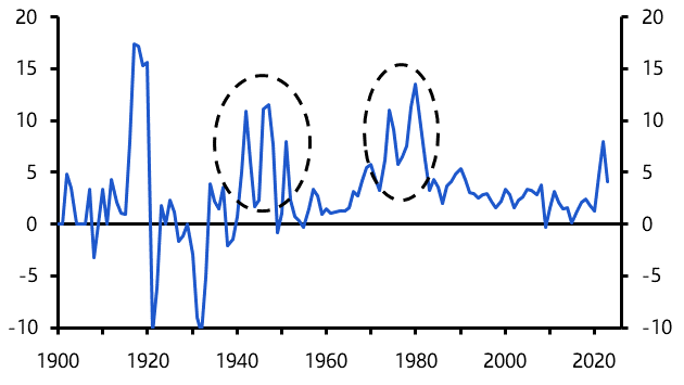
But the inflation surges of the 1970s were caused by the Arab oil embargo of 1973 and the Iranian revolution in 1979, both shocks to the global economy which sent first the price of oil and then consumer price inflation soaring.
Today’s disruptions to shipping in the Red Sea, which have occurred against a backdrop of generally rising geopolitical tensions, are fuelling concerns of a new, inflationary shock to global supply.
But these worries are overstated. Attention is fixed on a spike in spot freight rates, but the cost paid by importers is typically set on contracts of a year or more and so the moves in spot rates have overstated the rise in the overall cost of shipping goods.
What’s more, overall shipping costs make up such a small fraction of the sale prices of final consumer goods and services that even if costs doubled and all of this was passed onto consumers, this would add less than 0.4% to consumer prices.
And global oil prices – which are the other channel through which tensions in the Middle East could affect inflation – are broadly unchanged since the start of the year and substantially lower than at the start of Q4 last year. (See Chart 2.)
|
Chart 2: Brent Crude Oil ($pb) |
|
|
|
Sources: Refinitiv, Capital Economics |
There is a risk that developments in the Middle East create a new source of inflation pressure in developed economies, but it would require a substantial escalation that directly affects energy supply.
Post-WW2 is a better historical comparison
As we’ve argued before, the period after the Second World War is a better point of comparison with today’s inflation situation. Huge supply disruption, coupled with the abolition of price controls, contributed to a surge in inflation in the US in 1945-1946, which then fell sharply in the late-1940s (before the Korean War caused it to spike briefly in 1951). (Again, see the left hand dotted circle in Chart 1.)
Price controls have not been a major factor in the most recent inflation surge – although energy subsidies following Russia’s invasion of Ukraine have influenced inflation in Europe. But the disruption to both labour and product markets caused by the pandemic does have echoes of the supply-side dislocation caused by the mobilisation and then demobilisation of the wartime economy in the US and Europe. (See here.)
The key insight from this period is that, once supply and demand come back into balance, inflation can fall quickly.
Immaculate disinflation explained
Chart 3 helps explain this process. Think of the aggregate demand curve as sloping downwards, and the aggregate supply curve as shaped like a hockey stick. When output is below potential, firms produce any amount of goods and services at the prevailing market price. But when output reaches potential, the price demanded by firms to supply more starts to increase sharply.
|
Chart 3: Aggregate Demand and Supply Framework |
|
|
|
Source: Capital Economics |
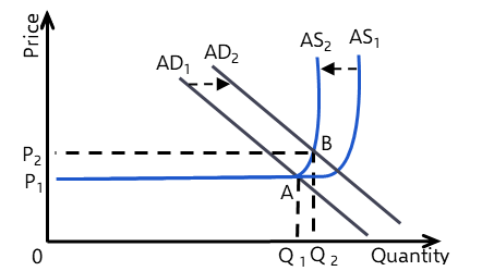
The one-two punch of the pandemic and the war in Ukraine caused the aggregate demand curve to shift out, from AD1 to AD2, due in part to the boost from pandemic-era fiscal stimulus and loose monetary policy. At the same time, it saw the aggregate supply curve shift in, from AS1 to AS2, as the pandemic and, to a lesser extent, the war in Ukraine caused dislocation in labour and product markets that reduced supply potential. These shifts meant economies moved from an equilibrium position of A, as seen in the chart, to an equilibrium position of B – output increased modestly but prices increased a lot (from P1 to P2).
However, once the supply-side disruption caused by the pandemic starts to fade and the aggregate supply curve shifts back to AS1, a new equilibrium at lower prices (P1) will emerge. What’s more, this appears to be happening in the absence of a large contraction in demand.
About that “last mile”
This all undermines the notion that the “last mile” back to inflation targets will be the hardest. In fact, the data suggest that some economies might be closer to the end than headline rates suggest.
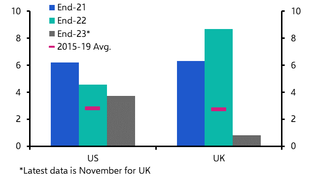
Yes, annual rates of core inflation – particularly in Europe – remain above levels consistent with central bank targets. In the UK, core inflation was 4.3% y/y in December, while in the euro-zone it was 3.4% y/y. Likewise, annual rates of wage growth remain high. But year-on-year changes in prices and wages tell us more about what was happening 12 months ago than what has been happening recently.
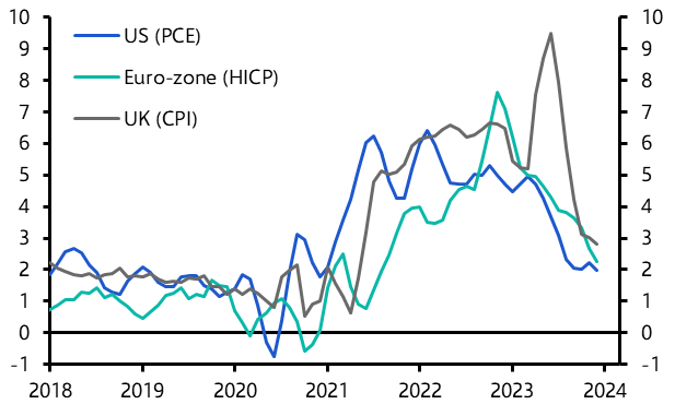
A very different story emerges if we look at the 3m annualised change in consumer prices. On this measure, core CPI is running at 3.0% in the UK and only 1.8% in the euro-zone. (See Chart 4.) Core PCE, which is the key measure of inflation for the Fed, is currently at just 1.5% on a 3m annualised basis.
|
Chart 4: Core CPI/PCE (3m annualised % change) |
|
|
|
Sources: Refinitiv, Capital Economics |
Likewise, 3m annualised changes in wages fell sharply over the second half of 2023 in the US and UK (euro-zone wage data is released on a quarterly basis and with a large lag). (See Chart 5.) The message seems clear: if we look at the most recent monthly data, both wage and price pressures appear to have faded substantially.
|
Chart 5: Wage Growth (3m annualised % change) |
|
|
|
Sources: Refinitiv, Capital Economics |
Cuts ≠ stimulus
With inflation falling like this, standing pat on rates means the real stance of monetary policy is getting tighter. Moreover, arguments against loosening fail to acknowledge that that policy is starting from a highly restrictive place. At this point, cutting interest rates would result in pressing less hard on the brake rather than jumping on the accelerator.
For markets, a key question is when central banks will act. This is a question about the “reaction function” of policymakers as much as anything else. In this regard, something to keep in mind is that history shows how policymakers’ communications tend to be asymmetric – interest rate hikes are often telegraphed well in advance, but rate cuts are not. (See here.)
We’ve pencilled in a first cut in the UK for June. Policymakers at the ECB have sent a clear message to markets that a first cut is also likely to come in the summer. But if Governing Council members are as “data dependent” as they insist, it may be too soon to rule out a cut before then given how much price pressures seem to be easing.
The big question surrounds the Fed. Officials have pushed back on expectations of a first cut in the fed funds rate this spring – a message that may be reiterated at this week’s meeting. But there’s a lot of data to come between now and the following FOMC meeting in March and we suspect that most of it will support the view that inflation pressures are fading quickly. On that basis, a March cut remains in play.
In case you missed it:
- Our Shipping Disruption Dashboard is a visual guide to the macro and market impact of maritime disruptions from the Red Sea to the Panama Canal. This special Chart Pack presents some of the key charts that investors need to understand the risks.
- Although the latest read of our proprietary China Activity Proxy pointed to further near-term improvement, scant progress on economic rebalancing means the Chinese economy faces a more painful adjustment in the long run.
- In light of Donald Trump’s victory in the New Hampshire primary, this October note highlighted the key risks around the 2024 presidential election.